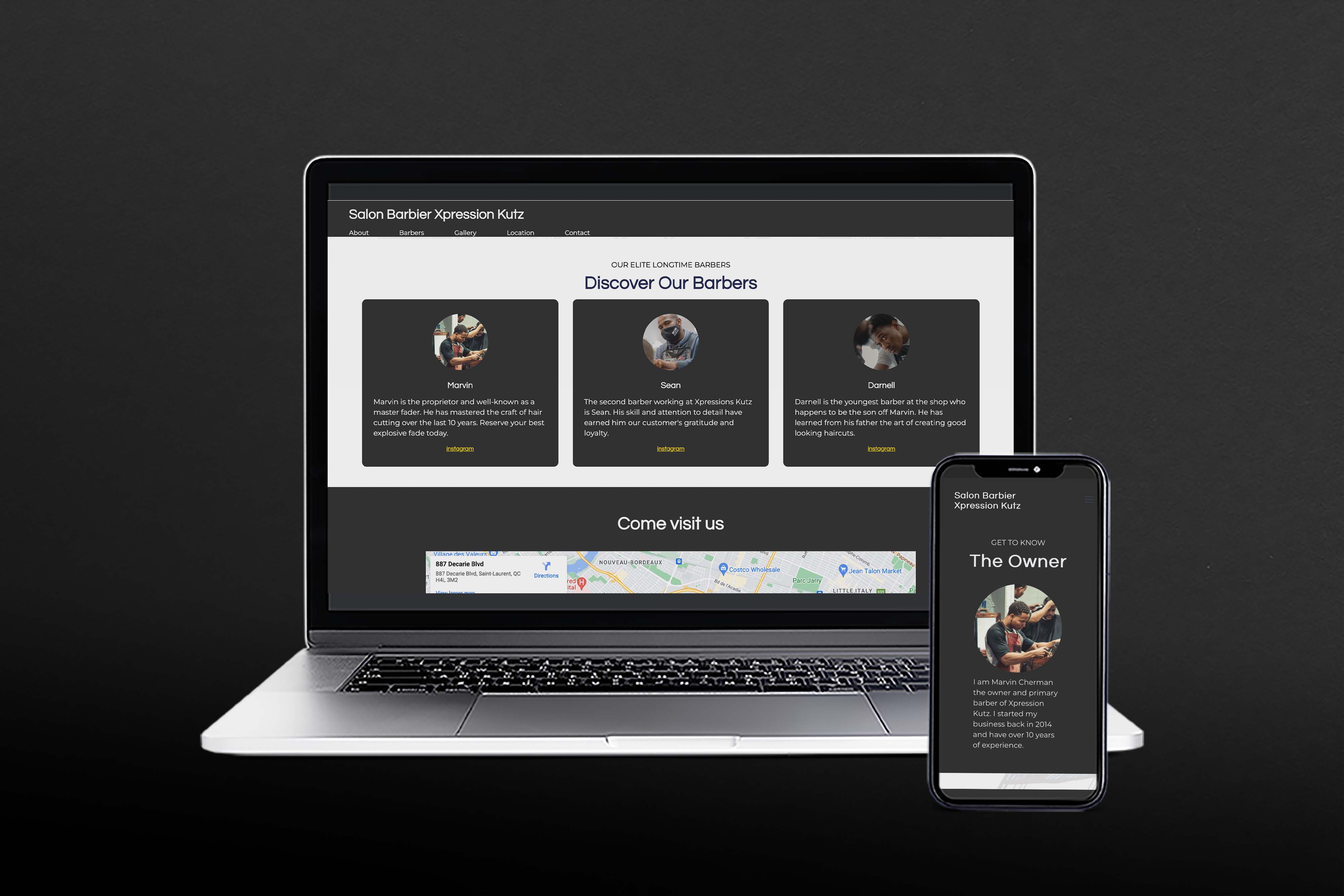
This project consisted of creating a website that enables to client to learn about the business, see some of their most asked for haircuts, the barbers, where they are located and how to contact them in addition to business hours.

There were a couple of challenges faced along the way however the main ones were having design freedom to design the website in whichever way I pleased and coding the website itself. The client did not have a previous website or have a brand identity, so it was like starting from scratch. As well as, coding is always a struggle.
In order to execute his vision without the client even having one, I created a moodboard to help him and myself create a well put together website targeting the correct audience and implement a design style.

As stated, my client did not have a previous website or a brand identity, so I need to create a moodboard as sort of my brainstorm that came in handy and later helped me with my color and choices.
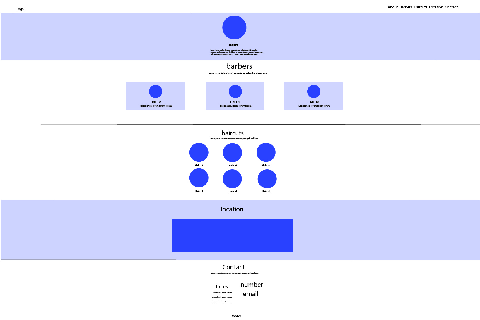
The wireframe was by far the easiest step but of course it was subject to change. I designed a very simple and straightforward layout. Because it is a barbershop it really does not need any animations or extra stuff especially since the clientele is male, they are visiting the website for one reason only. So, I designed the website in a chronological order that made sense.
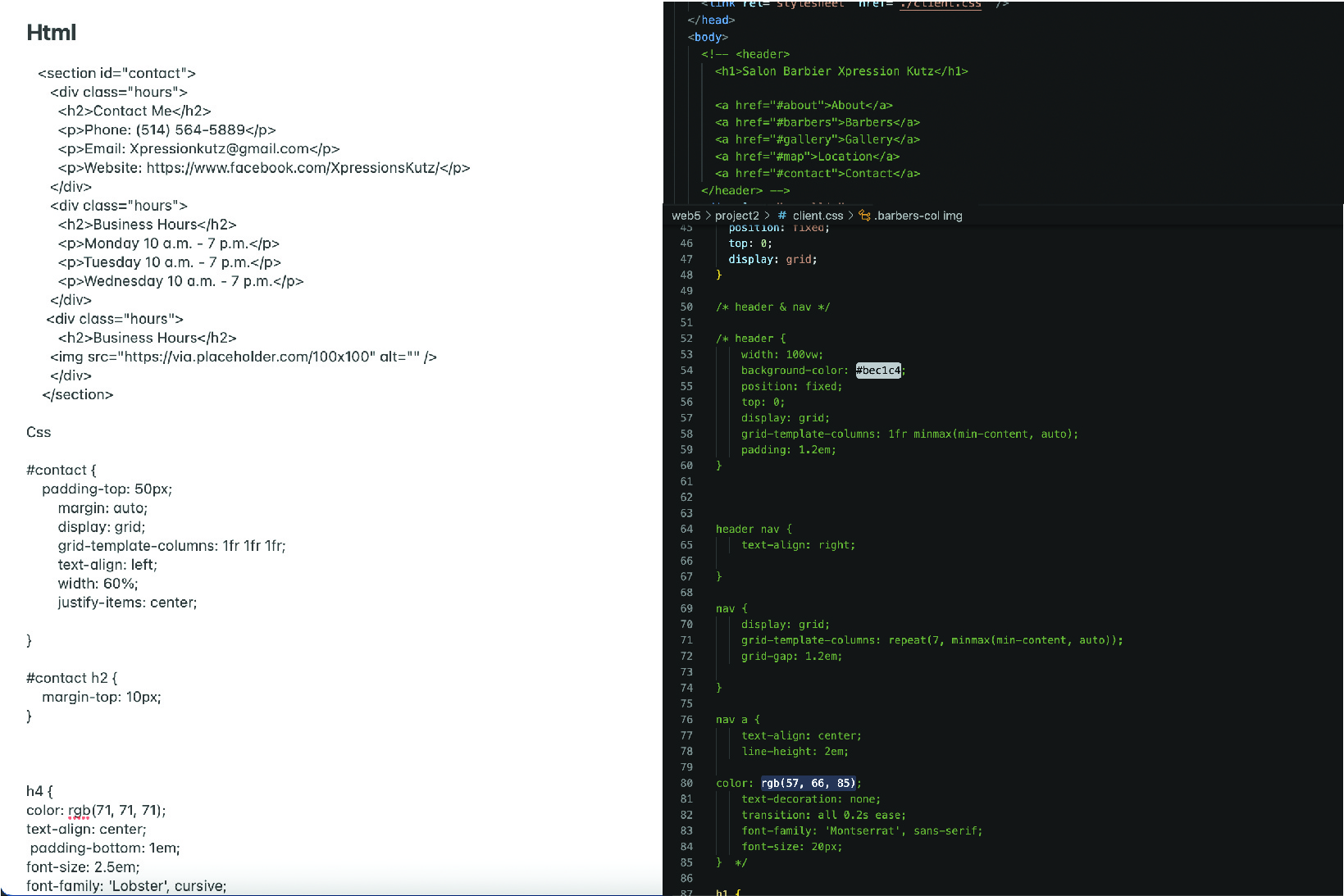
Once I had an idea of what I wanted the website to look like, it was time to put it together. This step was very hard. I took a lot of time and patients, a lot of trial and error. I was reusing code from my old projects, while looking a different code online. In the end it all came together.
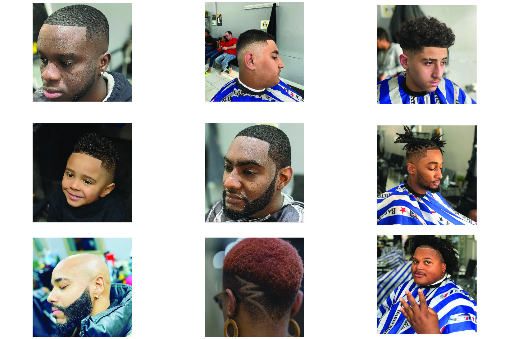
My client did not have any photos to give me, so I had to find these images by going on their Instagrams. They had quite a few images that had filters or the angle was off so it was a bit difficult. After finding these images I had to crop them all the exact shape so that in the gallery they would be coherent.


Overall, my client was pleased with the way his website came out. He liked the dark colors, the simple legible font and how straight forward and simple his website was. However, he did admit that he should have provided the images so that they were all taken in the same manner and to create a much unified look.
Customers can always locate them anytime, anywhere if they have a website. Any company without a phone number, physical address, or both a website and an email address would probably be viewed with suspicion by potential clients. Makes it possible for them to determine your typical consumer, how they found you, what they like, and how to adjust your business.